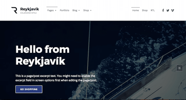
Reykjavik theme is a relatively new addition (October 2017) to WordPress’ family of accessibility-ready themes.
It was created by Oliver Juhas of WebMan Design. Oliver has created a number of accessibility-ready themes, some free and some paid.
The name Reykjavik evokes a product which is clean and modern. The theme description begins:
Reykjavik is fresh, lightweight, speed and SEO optimized, accessibility-ready WordPress theme perfect for your next business, portfolio, blog or WooCommerce e-shop website.
The theme is quite a small download; the zip file is 1.1MB in size. Compare that with Divi theme which is 6.2MB.
First impressions
On installing Reykjavik I saw immediately a nag notice to install the 7 (count them!) recommended plugins.
This practice irritates me, as I think it should be up to the user to decide what plugins he/she wants to use. Another drawback with required plugins is that they may not all be kept up to date by their developers.
The main reason for adding these recommended plugins is if you want to have all the content in Reykjavik’s theme demo.
I advise checking out the demo first to see if you need all the features used. If you don’t, there’s no need to install all the plugins. Plus some of the recommended plugins have a learning curve to use.
Reykjavik’s recommended plugins
Here’s what you might expect to use the plugins for:
- Advanced Custom Fields: adds extra options to customise your pages. More of a developer’s plugin. (Note that if you install the theme demo content, you’ll get the benefit of the ACF options without having to set them up yourself.)
- Beaver Builder (Lite version): a page builder plugin. Allows you to create advanced page layouts, e.g. with multiple columns.
- Jetpack: a Swiss army knife of a plugin with many features. The ones that are used in the Reykjavik demo are the Portfolio and Testimonials content types.
- One Click Demo Import: imports theme demo content. You can delete this plugin once that’s done, or skip installing if you don’t need the demo content.
- WebMan Templates: from the theme creator, this installs special templates for Beaver Builder – which you must have installed to use. If you’re not using Beaver Builder, you can skip installing this plugin too.
- WooCommerce: all you need to begin creating an ecommerce store. If you don’t plan to run an online shop, you don’t need this plugin.
- WooSidebars – allows you to create context-specific sidebars. For example, you could have a sidebar that only shows on a shop page. At the time of writing, this plugin hasn’t been updated for a year, and I think there are better alternatives available.
You can dismiss the plugin install notice if you don’t want to go ahead – but you might want to note the plugin names for later. (Or bookmark this post!)
Reykjavik theme documentation
I strongly advise checking out Reykjavik’s documentation before using this theme. It’s excellent.
I have rarely read documentation which is so comprehensive. It tells you just about everything you’d need to know about the theme and its associated plugins, and quite a bit about WordPress in general.
A few comments on the documentation’s accessibility:
- The Basics section has toggles which are not keyboard accessible.
- Some of the text and background combos are low contrast.
- There are also a series of instructional videos on Vimeo. I would like to see some captioning for these.
To demo or not to demo?
If you do want all the demo content note that you will need to add all seven recommended plugins. Otherwise, when you import the content, all or part of your import will fail.

Of course, the next thing you’ll want to do is edit or delete the bits you don’t want!
If you add the demo content to Reykjavik the Advanced Custom Fields plugin does add some page customisation features.
For example, disabling the intro section on a page erases the page title, featured image and widget section for that page.


What accessibility-ready features does Reykjavik have?
ARIA landmark roles
ARIA landmarks for navigation by screen reader users are all present and correct.
Keyboard accessibility
Menus are keyboard focusable, including the main navigation dropdowns.
Keyboard focus is obvious.

There are a number of skip links, mostly at the top of the page:
- Skip to main navigation
- Skip to content
- Skip to footer
- Skip back to main navigation (at the bottom of the content, before the footer)

There’s also a Back to top link in the footer.
Forms
The comment form labels are hidden as screen reader text. I prefer visible labels, but there are placeholders.
I’m less sure about the bottom borders indicating the form fields. It’s not until you focus on the fields that you see the full outlines. The comment field looks like one line until you start typing in it – then it expands.
Note that the contact form in the demo is just for show! You will need to install a plugin for a working form. One option is to use the Contact Forms module in Jetpack.
Headings
Headings are in the correct order on the pages in the demo. There is only one Heading 1 on each page: the page title.
Links
Links within the content should all be underlined. This is the case for links you enter yourself.
In the demo content, the table of contents has links which are not underlined. Other links are styled as buttons.
Continue reading links for posts have screen reader text. This means that users of screen readers can distinguish between them, but the post titles aren’t duplicated for sighted readers.
Social icons are marked up as SVG with screen reader text. This text is set as the Navigation Label in the Social Links Menu (Appearance > Menus).
Colour contrast
I tested a number of pages with the WAVE Chrome add-on, and it didn’t detect any contrast errors.
The primary accent colour is navy (#273a7d) which has a contrast ratio of 10.48:1 with the off-white background (#fefeff).
You can change the colours used in the WordPress Customizer (Theme Options section). Both foreground and background colours can be changed in various places.
Of course, if you do so you’ll then have to check that the colour combinations you choose are then accessible!
To pass the WCAG 2.0 AA requirements, you need:
- a 4.5:1 contrast ratio for foreground and background for normal text
- a 3:1 contrast ratio for foreground and background for large text

Media
The demo homepage includes a video which autoplays. Strictly speaking, this is a no-no for accessibility.
However, Twenty Seventeen theme – based on the same starter theme – uses video on the homepage too. Moreover, the video is silent, and the use of video is optional – you can use a static image instead. Also, like Twenty Seventeen theme, an image is loaded on mobile rather than the video.
The demo content has low-res photos. They’re meant as placeholders to be replaced with your own content.
All images with meaning have alt text. Make sure you add alternative text when you add your own images.
Typography
The body font is Open Sans, and the heading font is Montserrat – both sans-serif fonts which are good for readability.
The base font size is set to 18px, which is very clear. You can change this in Appearance > Customize > Theme Options > Typography (but please don’t make it smaller!) The slider is keyboard accessible – good job!
There is a “Use custom fonts” option in this section too. As advised, the best way to add a font is to use a plugin. Just remember to choose one that is clear to read to keep your site accessible.
I tested zooming the text only on the page to 200% size. As I hoped, it was still legible and didn’t bunch up.
See examples of typography and styles used in this theme in Reykjavik’s style guide online.
Accessibility of some recommended plugins for Reykjavik theme
Beaver Builder
You would have real difficulty using Beaver Builder to build pages if you can’t use a mouse.
With VoiceOver screen reader, I could not access the tab that opened up the Beaver Builder front-end editor.
With a keyboard, I could open it up to access the front-end editor. But I could not access any of the modules to add them using the Tab key alone.

WooCommerce
I liked the 3-step process on the demo’s shopping cart page, showing clearly where you are in the checkout process. You can enable this at Appearance > Customize > Theme Options > Shop (make sure Display checkout guide is checked.)
What are some of Reykjavik theme’s other features?
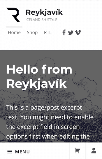
The mobile menu for the demo is a little different from most. There is a short menu at the top with 3 links and the social media icons.
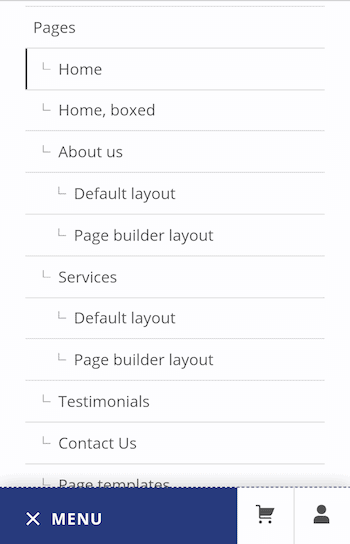
The main mobile menu sits at the bottom of the screen, with the Shop and My Account links as icons next to it. If you don’t have WooCommerce active, you won’t see the last two icons.


If you don’t like the mobile navigation, you can disable it at Appearance > Customize > Theme Options > Others. Uncheck the Enable mobile navigation box.
Page templates
There are six page templates. Their purpose is fully explained in the theme documentation.
- Default template
- Blank (to create landing pages)
- List child pages
- No intro
- With intro widgets
- With sidebar
Layout options
In Appearance > Customize > Theme Options > Layout you have options to:
- Control the width of the main content area.
- Enable fullwidth or boxed layout for the website, header and footer.
- Display the content in one or two columns.
WooCommerce options
You can show a store notice on your site as a banner. This would be useful if you had a sale or promotion.
Any other features that would be nice in Reykjavik?
The keyboard focus on the shop buttons is hard to see. It’s a dark blue dashed outline around a dark blue button. Perhaps a contrasting colour scheme on buttons might have worked better. Although that could conflict with the theme customization options.
It would be nice to have the option to add breadcrumbs to pages.
Summing up
I would say that yes – this theme is indeed clean, light and accessible.
It’s a well-built theme that covers a good number of uses. Business, designer and ecommerce sites could all run happily on it.
A lot of thought has gone into both the theme and the documentation.
It might be tricky to use for WordPress newbies though.
Reykjavik theme is a good choice for you if
- You want your site to have a good grounding in accessibility before you add your content.
- You intend to run an online shop and want it to have a high conversion rate.
- You need some customization options for your site, but not too many.
Reykjavik theme is not a good choice for you if
- You plan to run a very simple site.
- You are time-limited and want to get a website up and running quickly.
- You’re not comfortable installing, managing and learning how to use plugins.
Have you tried Reykjavik? Would you use it? Let me know in the comments.


Great write-up, as always. Given the described pros and cons, I’m keen to use this theme. Thanks for the info, Claire, and I’ll report back.
I really enjoy the theme. The only thing that bugs me (and it is a big problem, unfortunately) is that the featured images replace the header. This is not a problem if I’m not reviewing a book, but if I am reviewing a book, and I choose to feature the book cover (something that’s handy when pushing a post out to social media) then unfortunately you actually have to scroll to get past the header image!
Hi Lilyn
I see what you mean. The problem is that book covers are mostly in portrait format and featured images naturally are landscape!
There isn’t an easy solution to this. Have you thought of making your own featured image headers? You could perhaps incorporate a smaller version of the book cover as part of the header, with a similar coloured background behind it. Just a thought.
Thanks for commenting,
Claire