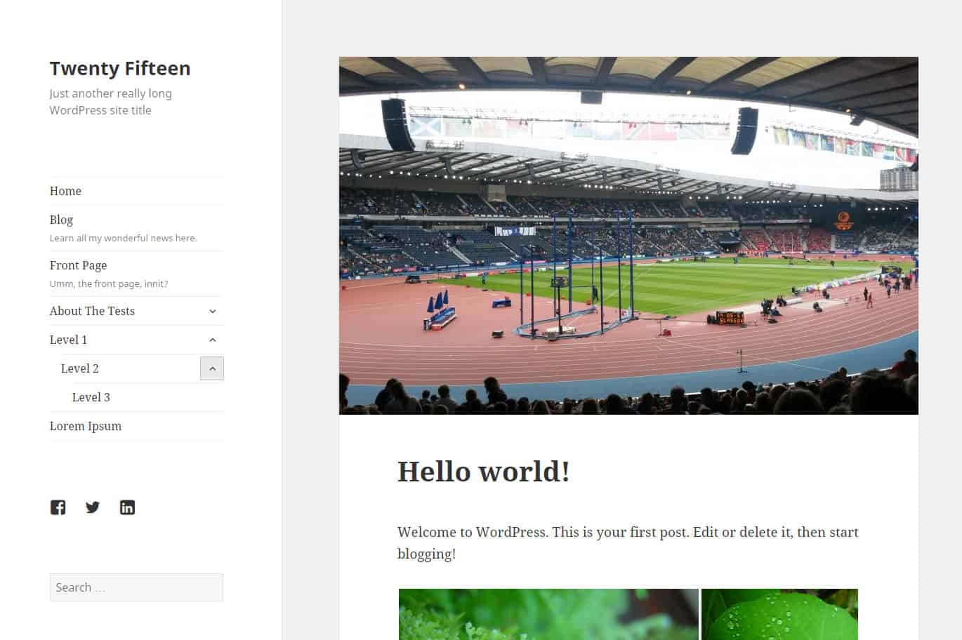
WordPress 4.1 was released last month, and along with it the Twenty Fifteen theme was launched. I’ve had a look at it to see what it can do.
First impressions
Twenty Fifteen has some passing resemblances to the previous theme from the WordPress.org team, Twenty Fourteen, with a left sidebar and widget area. But the look of the theme is very different.
At first glance, it is a very clean looking theme, though quite plain looking and barebones. The content is nicely centred in the browser as opposed to the left alignment of Twenty Fourteen (which I never really liked).

Typography
The theme uses the Noto Serif font as its primary typeface, with Noto Sans for metadata.
The standard font size is 19px, so it is very easy to read.
Navigation
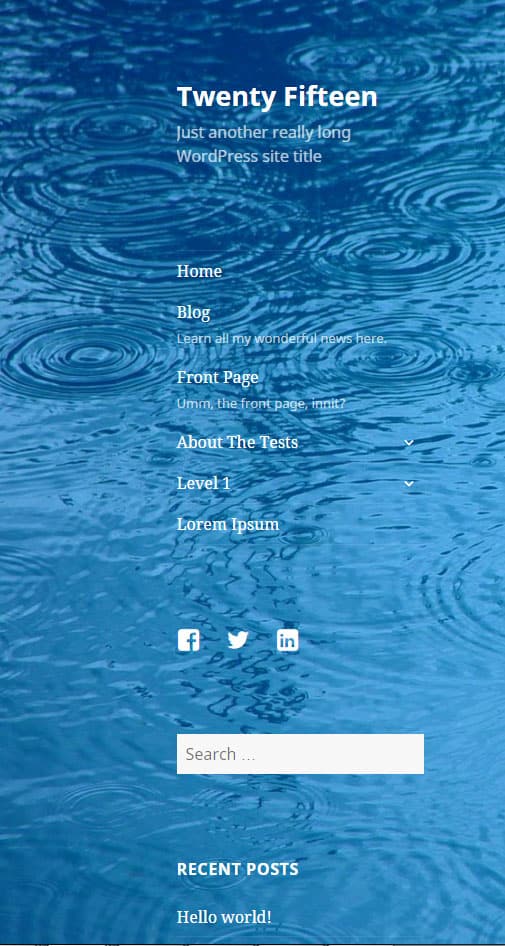
Unusually, Twenty Fifteen has vertical rather than horizontal primary navigation. There are 2 menus – the primary navigation and social links menu.
Both sit in the sidebar on the left, the former a vertical menu and the latter a collection of social media icons underneath.
Main menu descriptions
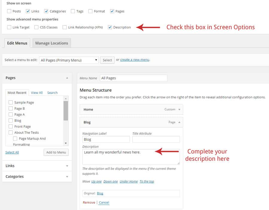
You can add a description under your main menu items easily:
- In Appearance > Menus, make sure the Description box under Show advanced menu properties is checked.
- Add a short description in the box for the menu item(s) you want.
To add the social links
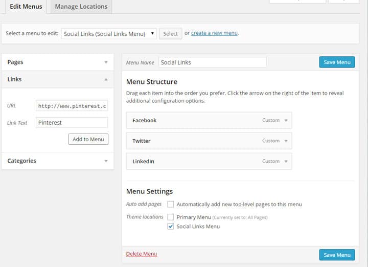
- Go to Appearance > Menus.
- Create a new menu and set it as the Social Links menu.
- Add the links to your social media profiles in the Links section by typing in the URL for each of your social media profiles and adding each link to the menu.
- Save the menu when you’re done. The theme is smart enough to put the correct icon in for each profile.
See the Twenty Fifteen guide for the full list of social profiles you can use.
Customization options
Most of the customization options are the same as for Twenty Fourteen. That is, from Appearance > Customize you can tailor the following:
- Show or hide the site title and/or tagline
- Select a background image for the page (and choose its position, whether it tiles and whether it’s fixed or scrolls)
- Set the menus
- Choose which widgets to display
- Set the front page to display posts or a static home page
There are a couple of differences from Twenty Fourteen. The main one is there are a number of predefined colour schemes to choose from. Aside from the default white/black/grey, you can choose from:
- Dark
- Yellow
- Pink
- Purple
- Blue
My favourite of these is the purple colour scheme.
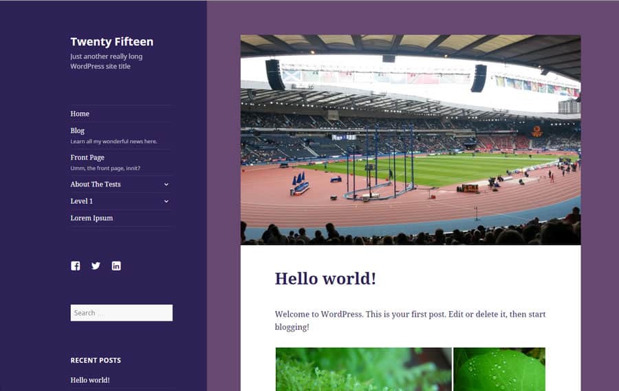
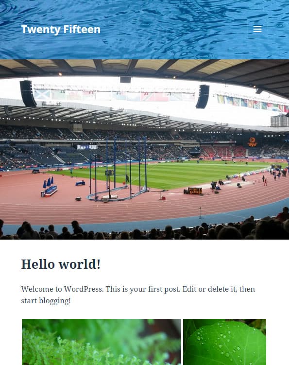
The other difference is that changing the Header Image on Twenty Fifteen actually changes the background of the entire sidebar (on desktop). Only on a mobile device is there a header image.
Layouts
You need to love the layout of this theme in order to use it, as there is no way of changing it out of the box. There are no page templates.
It would have been nice to have the option to choose a right sidebar instead of the default left one, either globally or on a per-page basis.
Widgets
There is only a single widget area in the theme, in the sidebar below the menus. So if you were looking for header or footer widget areas, you’re out of luck, unless you add your own to a child theme.
Featured images
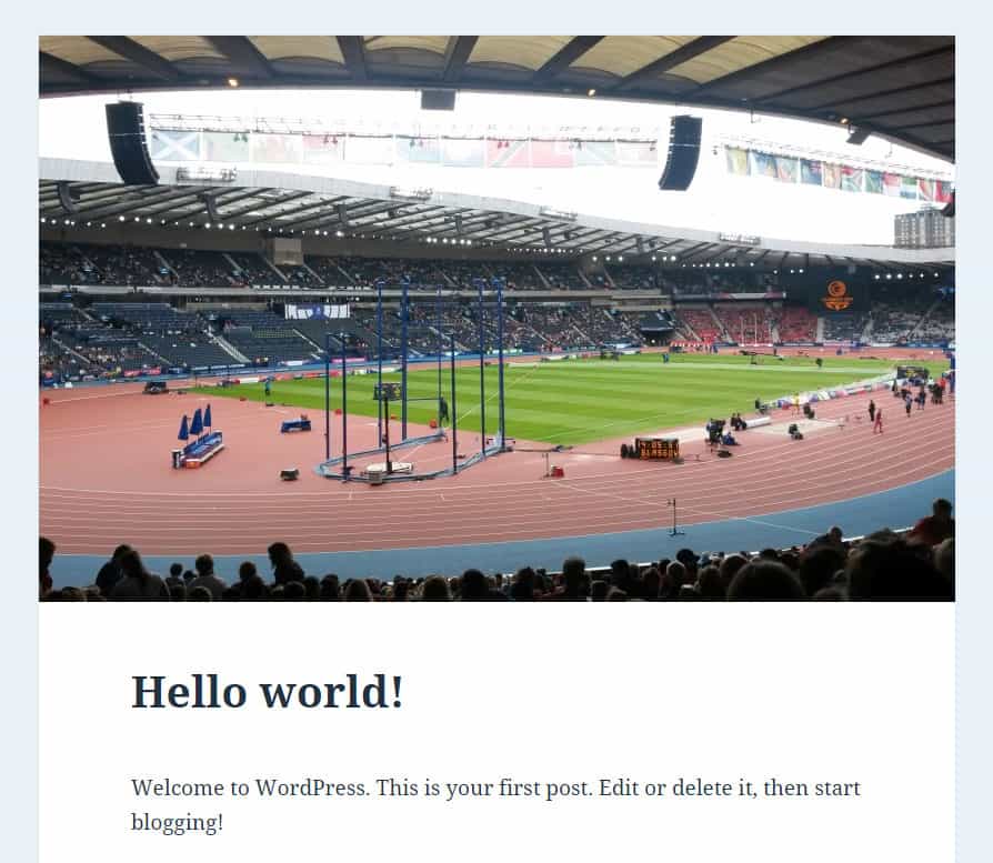
Featured images are supported in Twenty Fifteen. When added, they appear above blog posts.
Mobile responsiveness
Like most modern themes, Twenty Fifteen is responsive. The sidebar disappears at 954px width and is triggered by clicking on the hamburger menu icon.
The only downside I can see with this is that all sidebar content is shown before the page content. If you have a very long sidebar that’s a lot of links to scroll through. It would be more usual to show the menu first and have widgets displayed after posts/pages on a mobile device.

Accessibility
This is one area where Twenty Fifteen really scores. It’s been designed with accessibility in mind, has been tested by the Make WordPress Accessible team, and is one of the few themes to warrant the accessibility-ready tag.
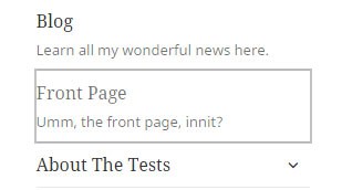
The theme is fully keyboard accessible, including multiple levels of menus. Menu items with submenus show a down arrow when closed, and an up arrow when opened. The keyboard focus is shown as a grey box round the relevant item.
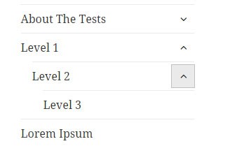
The theme supports WAI-ARIA, making use of roles.
Just one caveat if you want to use one of the colour presets, though. I tested the colours with the Colour Contrast Analyzer tool and the pink and blue colour schemes don’t meet WCAG colour contrast requirements.
I do wonder about the accessibility of the search box since it doesn’t have a Submit button, though that’s been a feature of the WordPress themes since Twenty Eleven. (It should be noted that the button has a class of screen-reader-text associated with it, which hides it from normal view. The submit button is read out to screen reader users.)
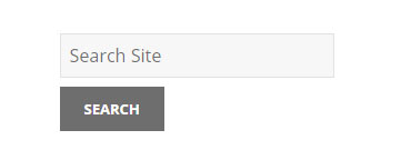
Add a submit button to the search box
If you want to add a submit button, here’s a way to do it:
1. Create a WordPress child theme.
2. Create a file called searchform.php and add it to your child theme. Include the following code:
<form role="search" method="get" id="searchform" action="<?php echo home_url( '/' ); ?>">
 <div><label class="screen-reader-text" for="s">Search for:</label>
 <input type="text" value="" placeholder="Search Site" name="s" id="s" />
 <input type="submit" id="searchsubmit" value="Search" style="margin-top: 8px;" />
 </div>
</form>
3. In your child theme style.css, add the following code:
.search-form input[type="submit"], .widget .search-form input[type="submit"] {
padding: 5px;
}
This is the end result:
Overall
The WordPress.org themes are always well coded, and this one is no exception. I like the simplicity and the accessibility features in Twenty Fifteen.
It seems a good theme to use for bloggers who are looking for a clean and white design, without too much fuss.
I can’t see it being adopted by many businesses, as it lacks flexibility, and I suspect they want more bells and whistles in a theme.
What do you think? Please leave a comment below.


I enjoyed both this article and the one on twenty sixteen. I’m trying to add menus or pages to the main page but cannot figure that part out. Example: Blog, About, Contact, etc…
Hi Sarah
You need to go to Appearance > Menus and select the Create a new menu option.
Add some pages to your menu, drag and drop them in order, set it to Primary Menu and save it.
Here’s a tutorial with some screenshots: How to Create a New Navigation Menu in WordPress Twenty Fifteen
Hope that helps.
Hello Claire, thanks for this informative post.
I have disabled comments on some of my pages. However, I would really like to eliminate the words “Comments are Closed” From the home page. Any ideas would be greatly appreciated.
Thanks in advance for your help.
Hi Robert,
Thanks for commenting.
I’ve always used the Disable Comments plugin to disable comments on pages, which has worked well for me.
However, if in fact you want comments on some pages, I’m not sure if it works for that.
I see you are using Neve theme, so another option is to ask Neve theme’s support forum for help.
Cheers
Claire
Great review and walkthrough of the Twenty Fifteen theme Claire which is still going strong today despite being released in 2015. In fact this year the theme was downloaded more than 5000 times in one day and hasn’t dropped below 1500 installs daily all year, so your post will be very helpful to plenty of people.
Is there anyway to get rid of the menu selection “WordPress.org”?
I’ve spent hours searching and if I can’t a solution soon I’ll find a new theme. I’m sorry to so do because I’ve used this great theme for years but I don’t want that selection with my new site revisions (seem so retro).
Thanks for any help you can give me here.
Hi Steve
The simplest thing would be to hide it with CSS {display: none;} but you need to be able to target the element in order to do that.