Updated 12 June 2019. This article is quite out of date now, and LinkedIn’s site and its apps have been updated considerably in that time. I’ve left it up for reference.
This is Day 14 in the 30 Day Blogging Challenge. You can read Day 13’s post here.
LinkedIn is a social network aimed at the business sector. It’s used by jobseekers, employees, recruiters and entrepreneurs to network online.
I’ve been using LinkedIn since 2012, initially using the website and more recently on mobile app (Android tablet and iPad). I’ve found the user experience to be different on each. In this post I’m going to share what I like and dislike about each version. I’m going to concentrate on the features I personally use, so not everything will be covered here.
Home (Updates)
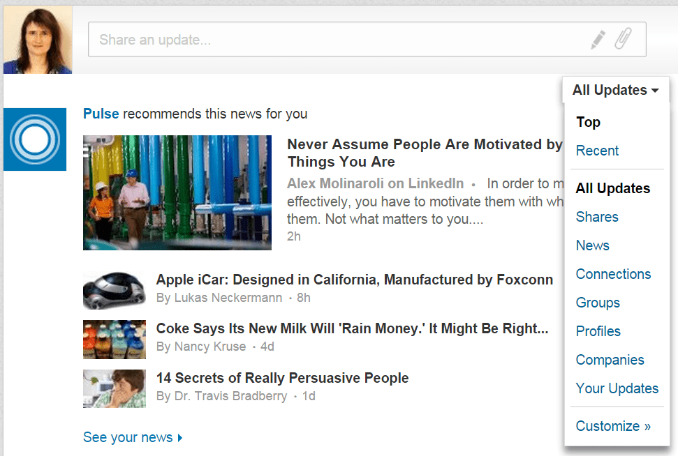
LinkedIn’s updates shows you the latest news stories, updates and connections made in your network. The strange thing is that the apps and the website all show updates in a different order. The default for the website seems to be “top” updates while the apps are “recent” updates.
The advantage of the website is that you can choose alternative views of your updates. Just hover over All Updates and you can choose from an array of options. This is useful if you want to drill down into specifics, such as who’s updated their profile lately or what’s been posted in groups.
To share your own update, it’s most obvious on the website (the big box with your photo on the left). On the apps you click a little comment icon to do the same thing.
Notifications

Notifications are by hovering (website) or clicking (mobile device) on the flag icon. The website and Android app appear to show them similarly, but the iPad app only shows one – and not even the latest one.
Winner: LinkedIn website
Search
The Search function on the website is intuitive enough to figure out what you are searching for and return results. You can also filter your results, e.g. People can be filtered by Relationship, Location or Current Company.
Both apps let you search by People, Jobs, Companies or Groups, nothing else.
Invitations to connect
The website wins hands down here, as the mobile apps do not allow you to personalize your connection requests – something I ALWAYS like to do, in the “add a personal note” box.

LinkedIn used to offer you the opportunity of choosing that you shared the same group when connecting, but no longer does so. This makes growing your network somewhat harder. Here are some alternatives to get round the “no groups” option. One of them being, ironically, using a mobile app.
Winner: LinkedIn website
Profile
The default view of your profile on the website is in edit mode. If you want to view it as another user, you need to click on the View profile as button and then you have the option to see it as your connections would, or as a member of the public.
Website users can go to Profile > Who’s Viewed My Profile and see some nice charts, which you don’t get with the apps, though you can get the statistics.
On Android, you get a nice summary of the main features and activity on your profile, which I like:

The iPad version looks the most sleek, although it doesn’t give you as much info as the Android app, and, unbelievably, iPad doesn’t give you an editing option. I don’t understand why the Share button is so prominent either.

Winner: Tie between website & Android app
Connections

The standard view for connections on the website is to list all contacts by recent conversation. I personally find this slightly annoying, as it mixes non-connections into your list. I can see the usefulness of listing by the last time one of you contacted the other though; this helps you keep track of your relationship building.
The apps have a standard A-Z listing of connections. The Android app is a simple list and the iPad version has a nice grid layout. There’s no way to reorder or filter the lists in either app.
You can download LinkedIn Connections to look after your business relationships. It gives you reminders of your connections’ work anniversaries, birthdays and new jobs.
Winner: iPad app for looks, website for usability
Jobs
On the website and apps, there is a listing of recommended jobs. You also have the option of searching in a particular city. The Android app failed completely for me here, listing jobs in my city that were irrelevant to my experience. The website and iPad app offered decent job search results, with the website having the most flexibility in search filters.
Winner: Website has the best search
Pulse
Pulse is LinkedIn’s News aggregator. I couldn’t find much difference between the website and Android versions other than different ordering.
Pulse is also available as separate apps on mobile:
- Pulse for Android
- Pulse for iPhone/iPad
Winner: a tie
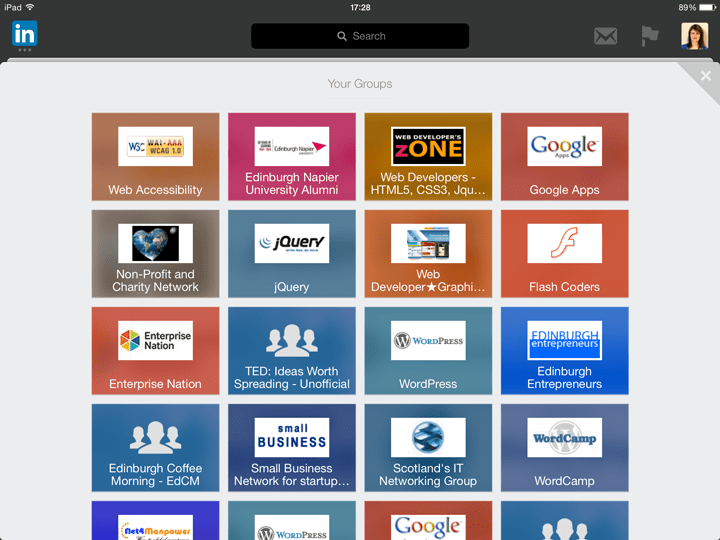
Groups
The layout of groups is different on all 3 platforms.
Website
The website lists your first six groups by default, with a See More link to more groups. Under this is a box where you can add a post to any group. Type in your topic title and details and you can select the group to post it in from a dropdown list.

Underneath this is a list of topics from groups, in no apparent order.
In an individual group, you can view Discussions, Promotions, Jobs and Members, and also search discussions.
Android app
Groups are listed alphabetically. Click on a group name to view the topics and the comment icon to start a new discussion.
iPad app
Groups are listed in a colourful grid, but the order seems random. When you click on a group you can view the discussions and leave a comment, but you don’t appear to be able to start your own discussion.
Winner: Website has the most functionality.
Overall
Personally, I find the website offers a better user experience over the apps. Having said that, I think there’s still a place for the apps. It’s certainly easier to reach for a phone or tablet and connect with someone you’ve met via the mobile app, or send a quick message.
What do you think? Please leave a comment and let me know your thoughts.

I find the linked in website very clunky in comparison to other social media sites and prefer viewing it on my ipad. However the lack of editing facilities on the ipad app is very annoying.
Fair point, Joanne. If LinkedIn could combine the slickness of the iPad app with the functionality of the website, they’d be on to a winner.
Great post Claire – worthy of sharing on LinkedIn :). I would like to provide feedback on the personal connection requests [section: Invitations to connect] – that is available on android – it has been for some time now.
I actually logged a trouble ticket (Oct. 2014) with LinkedIn.com as initially when they rolled out the feature on android it did not work as designed on gingerbread (android).
LinkedIn fixed it back in Dec. 2014.
Thanks for commenting, Patrick. I may not have the latest version of Android on my tablet. It’s good to know that they have added personalisation of connection requests to the Android app now.
I did share this post on LinkedIn. 🙂
Thanks Claire. I did publish a book about the Mobile App on LinkedIn. Would you like to review it? The link to the eBook is here: http://mybook.to/pyp
Will you be publishing an update on your blog about the new 4.x version that came out on Dec. 2015?
I found that information on the website is not the same as on the iPad app. Example, there was a profile view on the website which did not appear on the app. I have noticed this consistently over the last year.
Thanks for reading and commenting, Cyprian.
Yes, I’ve noticed the same thing myself. I don’t know how often the iPad app is updated, but it seems to consistently miss things. I hope one day it will be synced with LinkedIn’s website.
Searching posts is easy in website. For ex for January 2016 posts with hash tag #skillgap cannot be searched on the app.
Winner: website