
What is QualiBooth?
QualiBooth is an automated accessibility software which scans a website and reports back on any accessibility issues, pinpointing their source and offering suggestions to fix them.
It monitors web pages over real time and updates as accessibility problems are remediated.
How is QualiBooth priced?
QualiBooth offers a 7-day free trial for you to evaluate the software.
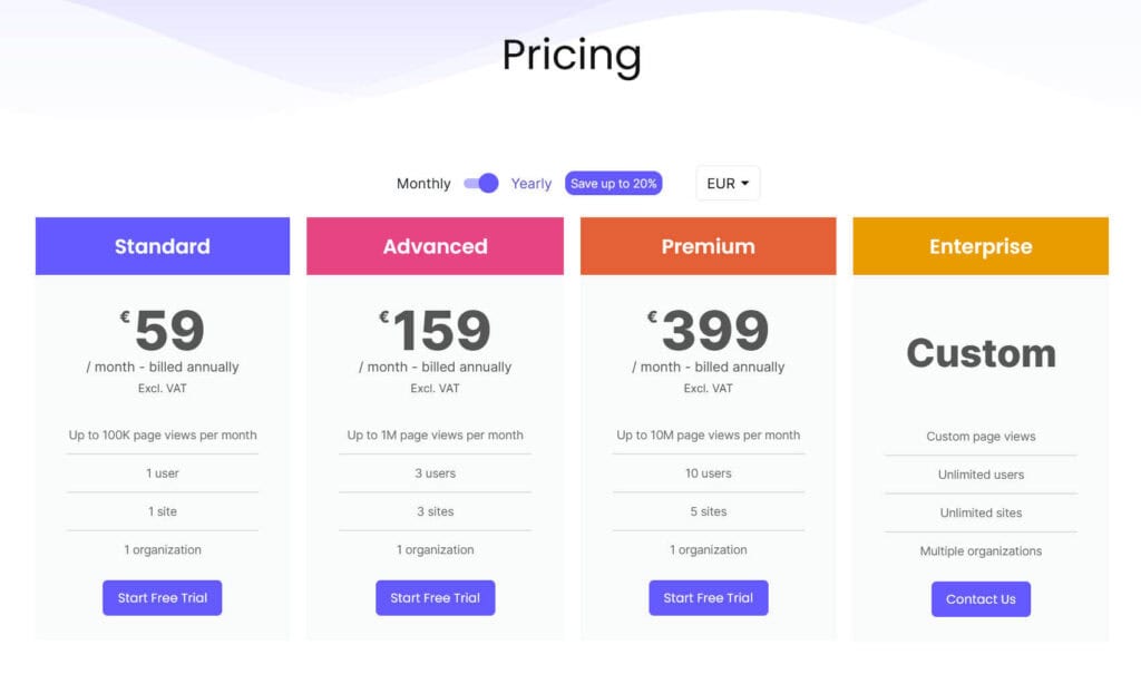
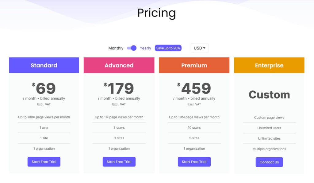
After that period, continued use depends on paying for an appropriate plan, which will depend on the the number of users, sites and pageviews you have. The Standard plan is for 1 user, 1 site and up to 100K page views a month, which costs from €59/month or $69/month. The Advanced plan covers 3 users, 3 sites and up to 1 million page views a month – this costs from €159/month or $179/month. The Premium plan is for 10 users, 5 sites and up to 10 million page views a month and costs from €399/month or $459/month. Finally, there are Custom plans available if you are running an Enterprise level site or sites. Note that all prices exclude VAT.
QualiBooth says of the enterprise plan:
The enterprise plan is tailored to meet the unique requirements of each customer. It provides a higher allocation of page views compared to other plans, unlimited sites and users, and the flexibility to utilize multiple organizations. In addition, our customers benefit from customized accessibility testing conducted by a team of experts, including individuals with disabilities, and receive premium-level support.
For the purposes of this review, I had access to a free trial beyond the 7 day period.
How does QualiBooth work?
Setup
After signing up, you create an organization and then add your first site URL using the Add Site button.
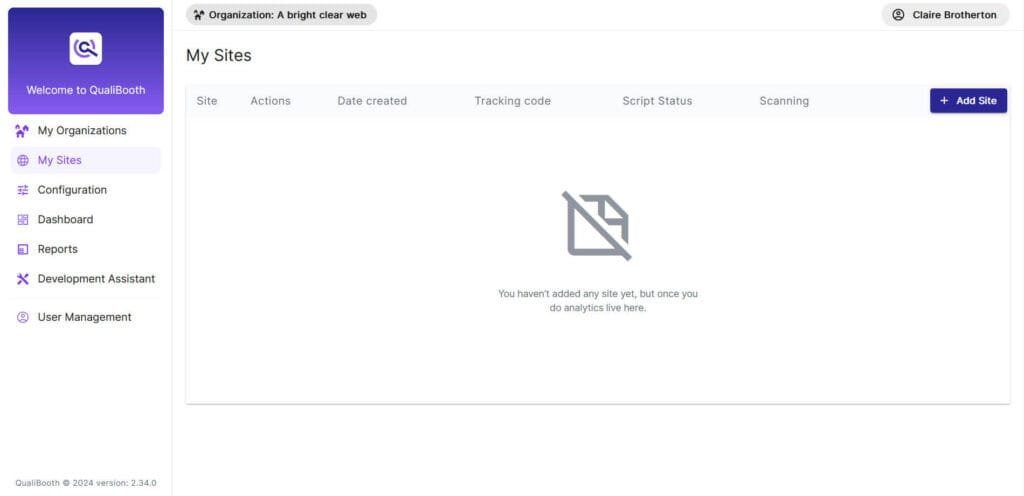
When you’ve added the site, you then need to add the QualiBooth tracking script so that it can start monitoring your site for accessibility issues. You get this from the Tracking Code button in your site’s listing. For a WordPress site you can add this script to every page in your theme settings or by using a plugin such as the WPCode plugin.
You need to wait a short time for the tracking code to become active. When it says it is, your website will be scanned by QualiBooth and it will start collecting data.

Configuration
There are a few configuration options you can use with QualiBooth. You can use tags to specify web pages with particular words in the URL. You can also change the percentage of pages scanned; the default is 100%. In the scanning options you can enable WCAG 2.2 rules or AAA rules. Finally, if you’re a Jira user, you can integrate QualiBooth with Jira and create automatic Jira tickets using your QualiBooth account.
Dashboard
The Dashboard gives an overview of your site(s) in pictorial format.
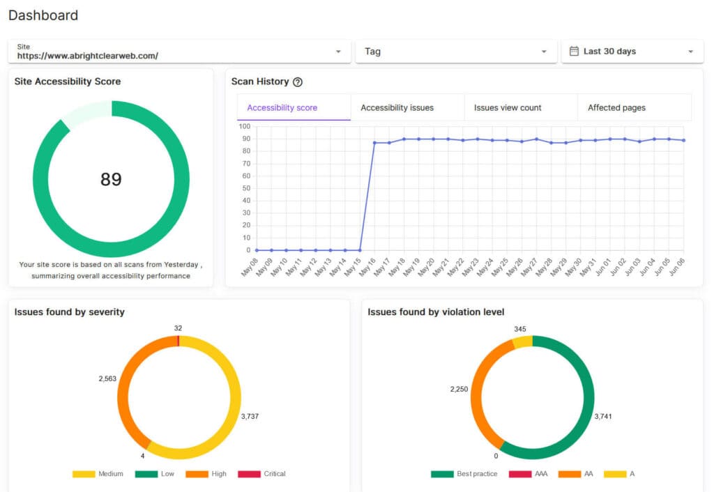
First of all, there’s a Site Accessibility Score – out of 100 – based on scans from the last 24 hours. A score of over 85 is high indicating few accessibility problems, a score of 60-85 is medium and a score of under 60 is low, meaning there are more accessibility issues.
The Scan History shows the fluctuation in score over time.
Issues found by severity is a pie chart of the issues found, graded either Critical, High, Medium or Low.
Issues found by violation level shows the issues graded by the violation type of the level in the Web Content Accessibility Guidelines (WCAG) from A to AAA, where A is a must and AAA is a nice to have. Best practice issues are not specified in the guidelines, but are good accessibility practice to follow. Most websites following WCAG aim to meet level AA. Note that AAA issues will only appear here if you’ve chosen to scan for them.
Reports
The Reports section lists all the issues found by QualiBooth by type, severity, violation and count.

Clicking on an issue takes you to a list of the URL(s) of any page(s) where the issue was found.

From there you can click on the tool button to view the page with the Development Assistant.
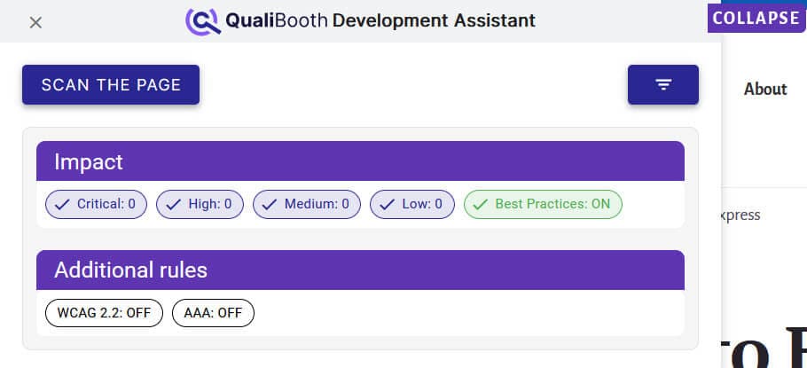
Scan the page to see the results. In this case, the original issue found on the page (Images must have alternate text) wasn’t found in the scan but other issues were.
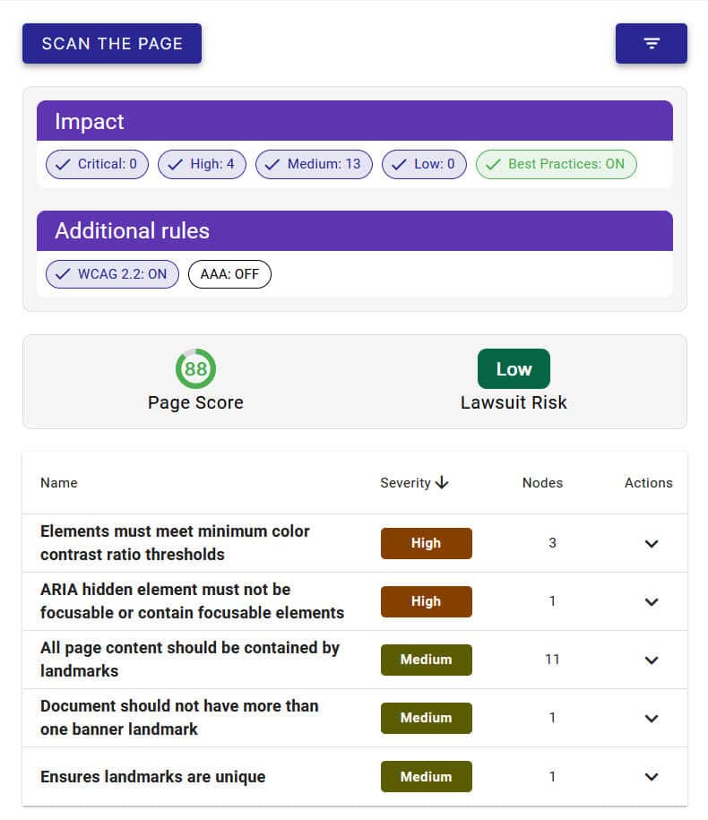
QualiBooth displays a page score, lawsuit risk and a list of the issues it found.
You can click on the arrow in the Actions column to show more detail, and the individual element to show the exact place on the page the violation occurred.

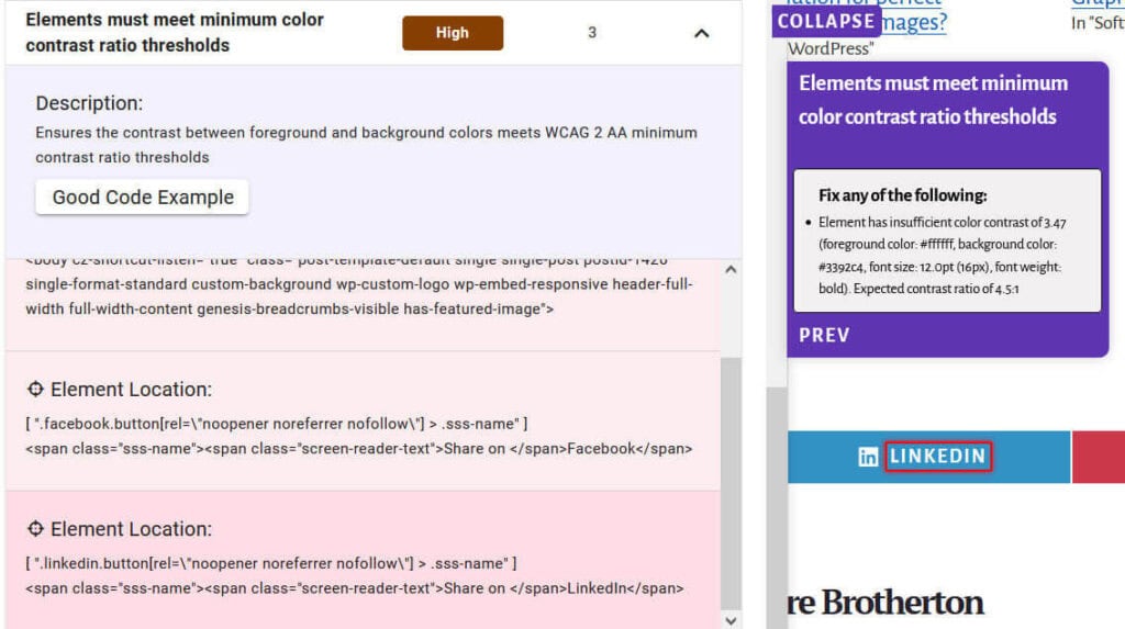
In this case, the background colour of the LInkedIn social sharing button doesn’t have sufficient contrast with the white text.
Some issues come with examples of good code that you can adapt to remediate that particular issue.

Development Assistant
The Development Assistant link opens the home page of your site in the Development Assistant, ready for a scan.
If you’re a WordPress user, I recommend not being logged into your site when you run a scan, as it will pick up accessibility issues related to the ARIA usage on the WordPress admin bar. This is part of WordPress Core and is only an issue for logged in users, which should not include your visitors (unless you have a membership site or similar).

An additional feature of the Development Assistant is that you can highlight screen reader navigation mode by clicking on the eye icon.

After you’ve enabled the mode, you’ll see arrows on the page indicating the path through the page that a screen reader user would follow. This could help you find an illogical tab order, for example.

What sorts of issues does QualiBooth find?
Here are a few examples of accessibility issues found by QualiBooth. I installed it on my site as well as some test sites.
<ul> and <ol> must only directly contain <li>, <script> or <template> elements

This error is found in the navigation in the Twenty Twenty-Four theme with the WordPress Theme Test Data added. It occurs because the navigation has been marked up as a list incorrectly. The code shows a <ul> element nested in another <ul>. The correct code should have the second <ul> as a child of the <li> element.
Deque University reference: <ul> and <ol> must only directly contain <li>, <script> or <template> elements
All touch targets must be 24px large, or leave sufficient space
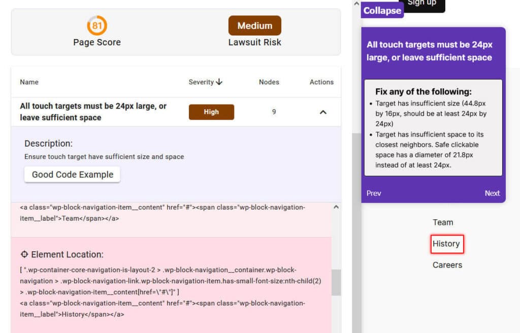
This error occurs in the default content for Twenty Twenty-Four theme when testing against WCAG 2.2. The footer menu items are too small and are too close together to make touch targets of the correct size. The solution would be to make the links bigger with CSS or to increase the space between them.
Deque University reference: All touch targets must be 24px large, or leave sufficient space
Heading levels should only increase by one

QualiBooth picked up on a missing heading level in the Hello Elementor theme. The heading level jumped from a Heading 1 (the post title) to a Heading 3 (One Response).
The best solution would be for the comment section in the theme to be coded to have a Heading 2.
According to David Swallow, a skipped heading level doesn’t represent a failure of WCAG, but not skipping heading levels is considered good practice.
Deque University reference: Heading levels should only increase by one
The skip-link target should exist and be focusable
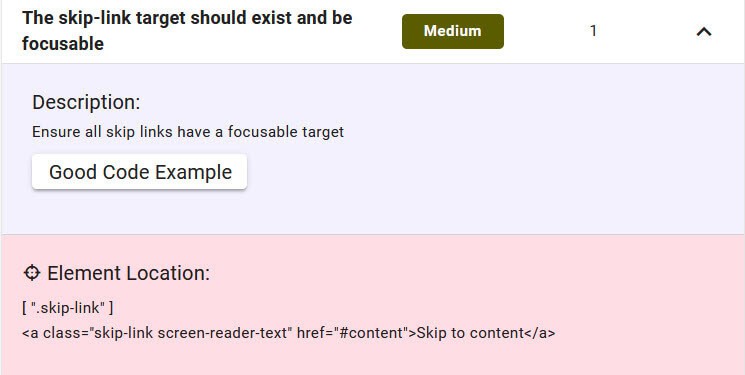
On the page I created in the Hello Elementor theme, it has a skip link but the link points to an element with the id content. No such id exists on the page.
As explained in the issue ”Skip links are not focusable” in some of elementor pages it happens when you use either an Elementor Single Post Template or the Elementor Full Width Page Layout. That strips out the <main id="content"> from the theme which breaks the functionality of the skip links.
Deque University reference: The skip-link target should exist and be focusable
Elements must only use supported ARIA attributes

The Elementor accordion title has an ARIA role of button but uses the aria-selected="true" property. This is not allowed for this role.
This is an open issue on GitHub: Accordion and Toggle have broken accessibility
Deque University reference: Elements must only use allowed ARIA attributes
Elements must only use permitted ARIA attributes
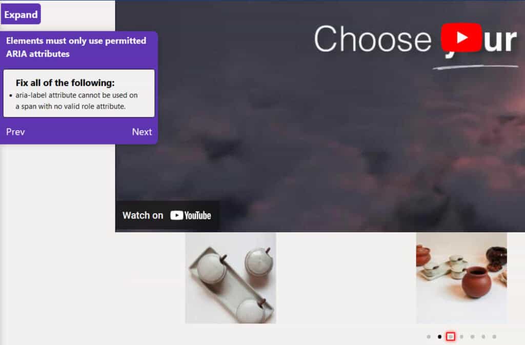
The issue here is with the Elementor carousel. The bullets for the pagination are marked up with <span> tags which have no ARIA role, so the aria-label attribute they have been given is invalid. This is an issue for the Elementor plugin developers to fix.
Deque University reference: Elements must only use permitted ARIA attributes
All page content should be contained by landmarks
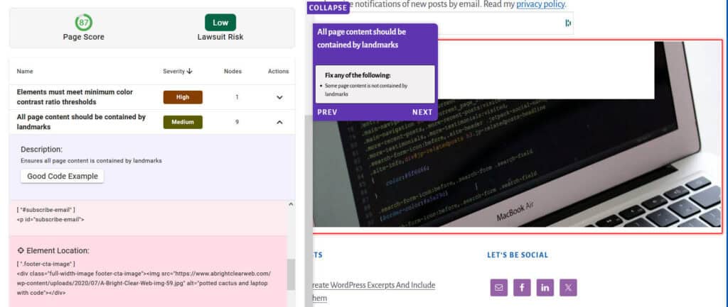
QualiBooth picked up on an number of instances of this issue on my site’s homepage. Various sections on the page were not enclosed in semantic HTML elements such as <header>, <main> and <footer> or were lacking ARIA roles indicating their purpose.
This is an issue with the child theme of the Genesis Framework that I’m using, Breakthrough Pro.
Some of the content not marked by landmarks included:
- Breadcrumbs
- Post entry-meta
- Post featured image
- Blog subscription widget
- Footer widgets
Deque University reference: All page content must be contained by landmarks
Document should not have more than one banner landmark

I was confused with this error until I used the Firefox Landmarks Extension. This shows that I have 2 banner landmarks, the site header and the post header.
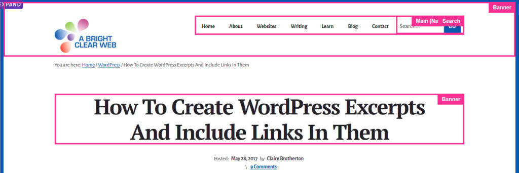
This happens because the post heading has been moved out of the loop through the breakthrough_move_page_headers() function in the theme.
Deque University reference: Page must not have more than one banner landmark
Ensures landmarks are unique
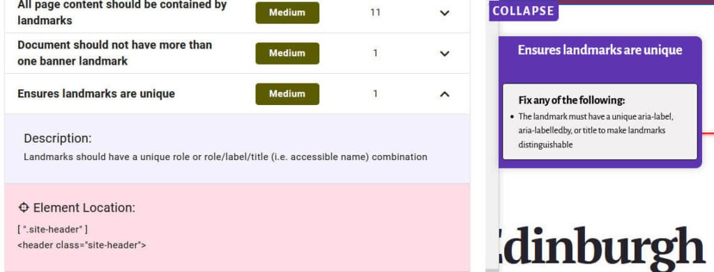
The issue highlighted is that landmarks should have a unique role or role/label/title (i.e. accessible name) combination. As there are multiple <header> elements, each one needs a unique identifier via the aria-label or aria-labelledby attribute.
Deque University reference: Ensures landmarks are unique
Frames must have an accessible name
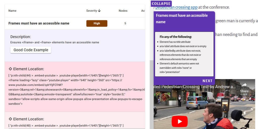
This issue occurred on some of my posts with YouTube embeds, which were lacking a title or appropriate ARIA attributes.
This shouldn’t have happened because YouTube embeds on WordPress have title attributes.
After some investigation, I found that the Jetpack plugin which I use was stripping out the title attribute from the embed code. The solution was to disable the Jetpack shortcode embeds feature.
I also had the same issue with a Vimeo embed. There is a post noting the missing Vimeo block title attribute here. Unfortunately this does not appear to have been fixed in WordPress Core yet.
Deque University reference: Frames must have an accessible name
Scrollable region must have keyboard access

I had this problem on some posts that included GitHub gists.
One solution would be to include tabindex="0" on the scrollable regions, but as the gists are embedded using Javascript, I’m not sure how to implement this.
Deque University reference: Scrollable region must have keyboard access
ARIA hidden element must not be focusable or contain focusable elements

I found that this issue links to the Antispam Bee plugin, which adds a hidden textarea as a honeypot to guard against spam comments.
I raised this issue on the Antispam Bee WordPress support forum, and got this reply:
This code is our “honeypot”. It is hidden for sighted people with the CSS in the style attribute, and hidden to assistive technologies via aria-hidden=”true”. A bot fills out every form markup, including this hidden textarea. If there is content submitted in this field, we know it is spam, because no user (sighted or not) will recognize it, as it is hidden.
This is therefore a false positive, because it is the intention of this code to be hidden for everyone.
Deque University reference: aria-hidden elements do not contain focusable elements
Headings should not be empty

This came up on an older post using the Classic Editor which had created a couple of empty Heading 3s.
The solution was to edit the post to remove them.
Deque University reference: Headings should not be empty
Elements must meet minimum color contrast ratio thresholds
This issue came up in relation to my social sharing buttons: the brand colours for Facebook and LinkedIn didn’t have sufficient contrast with the white text.
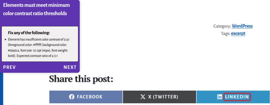
For the time being, I have removed my social sharing buttons. It will be interesting to see if this has any impact on my pageviews!
Deque University reference: Elements must meet minimum color contrast ratio thresholds
Form elements must have labels

I deliberately created an HTML page with some accessibility errors to see if QualiBooth would pick up on them.
It flagged that my form lacked form labels. The code was:
<p>Name: <input /></p><p>Email: <input /></p>
<p>Website: <input /></p>
<p>Comment: <input type="textarea" rows="4" cols="50" /></p>
<p><input type="submit" value="Submit"></p>
This could be made accessible by adding labels to the form, like so:
<p><label for="your-name">Name:</label>
<input type="text" name="your-name" id="your-name">
</p>
<p><label for="email">Email:</label>
<input  type="text" name="email" id="email">
</p>
<p>
<label for="website">Website:</label>
<input  type="text" name="website" id="website">
</p>
<p>
<label for="comment">Comment:</label>
<input type="textarea" rows="4" cols="50"name="comment" id="comment"/>
</p>
<p><input type="submit" value="Submit">
</p>
Deque University reference: Form <input> elements must have labels
Images must have alternate text

QualiBooth picked up on the image lacking alternate text.
This is an easy fix, by modifying the original code
<img src="oranges-1995079.jpg">to
<img src="oranges-1995079.jpg" alt="oranges and orange flower">Deque University reference: Images must have alternate text
Links must have discernable text
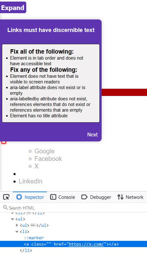
This can be corrected by adding the target of the link to the code, from
<li><a href="https://x.com/"></a></li>to
<li><a href="https://x.com/">X</a></li>Deque University reference: Links must have discernable text
Page should contain a level-one heading
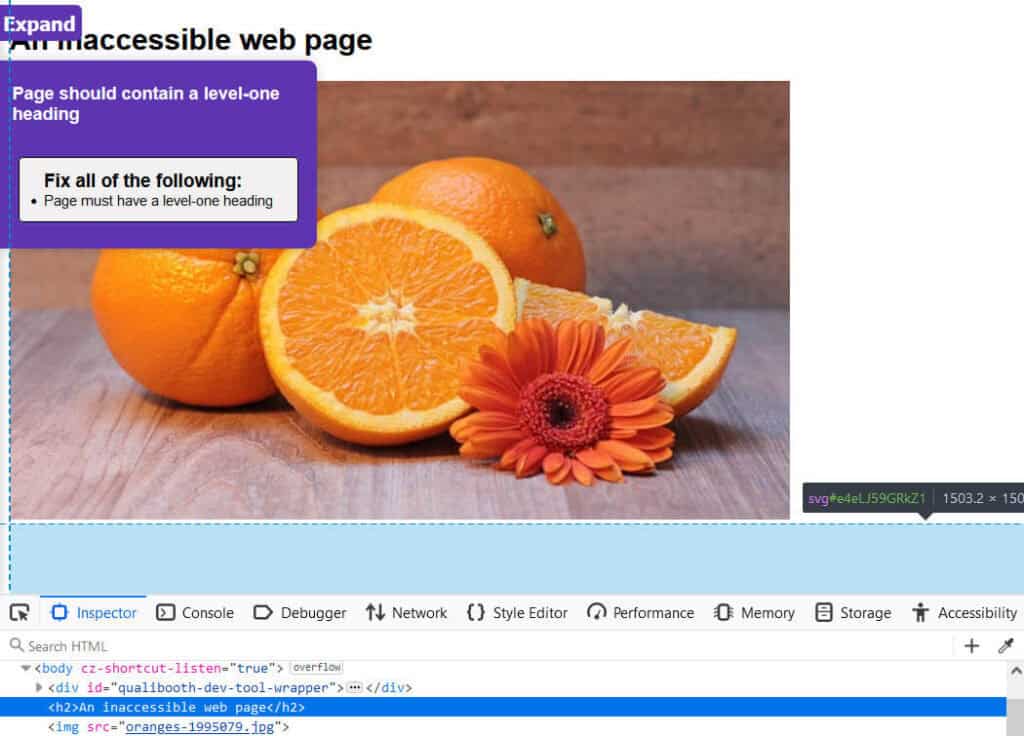
QualiBooth found that the page lacked a Heading 1. It starts with a Heading 2 instead.
This can be corrected by changing the <h2> to a <h1>.
Deque University reference: Page must contain a level-one heading
<li> elements must be contained in a <ul> or <ol>
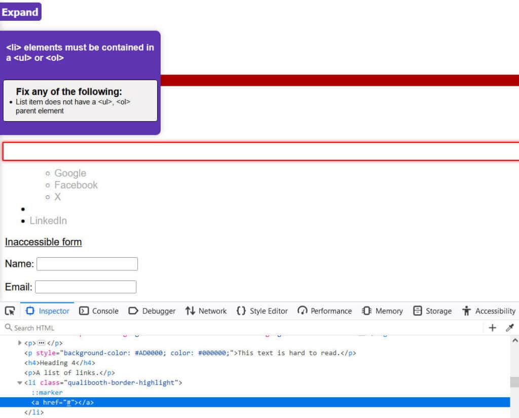
This error occurred because a <li> element was orphaned. It needs to be added into the list of links and given a proper target.
From
<li><a href="#"></a></li>to
<ul>
<li><ul><a href="https://www.google.com/">Google</a></li>
<li><a href="https://www.facebook.com/">Facebook</a></li>
<li><a href="https://x.com/">X</a>
<li><a href="https://www.instagram.com/">Instagram</a></li>
</ul></li>
<li><a href="https://x.com/">X</a></li>
<li><a href="https://www.linkedin.com/">LinkedIn</a></li>
</ul>
Deque University reference: <li> elements must be contained in a <ul> or <ol>
<svg> elements with an img role must have an alternative text

This error occurs because the <svg> that was added is missing a title to describe it.
<svg role="img" id="e4eLJ59GRkZ1" xmlns="http://www.w3.org/2000/svg" xmlns:xlink="http://www.w3.org/1999/xlink" viewBox="0 0 300 300" shape-rendering="geometricPrecision" text-rendering="geometricPrecision"><polygon points="0,-114.769303 33.729852,-46.425158 109.152093,-35.465665 54.576047,17.732832 67.459704,92.850316 0,57.384651 -67.459704,92.850316 -54.576047,17.732832 -109.152093,-35.465665 -33.729852,-46.425158 0,-114.769303" transform="translate(150 154.41688)" fill="#efda04" stroke-width="0"/></svg>This can be fixed by adding a title attribute to the code after the role="img” part:
<svg role="img" title="A yellow star"Deque University reference: SVG images and graphics require accessible text
Fixing landmark issues on my site
I decided to make changes to my theme to fix the issues with landmarks that QualiBooth highlighted.
- I gave the hero section on the home page a
roleofcomplementary. The main content of the home page fits in the<main>element. - I removed the
headings.phpfile from the theme and the reference to it infunctions.php. This had the effect of moving theentry-headerandentry-metainto the<main>element on the page. As noted in the article How to use HTML5 sectioning elements to create useful accessible landmarks, a<header>element can sit within a<main>element and not be considered a landmark. This action fixed the duplicate banner landmark and landmark not unique issues I had. I also moved the breadcrumbs to<main>. - I gave the subscribe area above the footer widgets an
aria-label="Subscribe"androle="region". - I gave the footer widgets a
role="region"andaria-label="About this site". - I added support for featured images on posts and pages. These would be part of the
<div>with classentry-content. - I made a number of CSS changes to retain the site’s spacing with the updated code.
After I did this, I only got one All page content should be contained by landmarks warning and that was for the skip link. Skip links don’t need to have a landmark, so this is okay.
What limitations does QualiBooth have?
QualiBooth is built on top of the Axe Core library; you can read the full list of accessibility checks QualiBooth makes. According to Deque, with axe-core, you can find on average 57% of WCAG issues automatically.
However, automated accessibility checkers like QualiBooth can’t check for every single accessibility issue. For example, a checker can detect if an image is missing alt text, but if alt text is present, a checker can’t tell if it makes sense in context. You will still need to make manual accessibility checks to ensure your website is compliant.
For more information on this topic, read 12 Issues Automated Web Accessibility Checkers Can’t Detect.
I did find that QualiBooth occasionally showed false positives in the Reports which didn’t show up when I used the Development Assistant.
Summing up
With legislation like the European Accessibility Act coming into effect in June 2025, it is more important than ever to ensure that your website is accessible.
Tools like QualiBooth help greatly in doing the spade work to find accessibility issues. QualiBooth is easy to set up and use, and helps you stay abreast of any accessibility problems with its real-time monitoring. Another plus point is that QualiBooth can scan protected pages and report on them. It also checks for issues that aren’t part of WCAG, but are good accessibility practice.
In terms of value for money, QualiBooth is more suited to small to larger businesses than freelancers like me. QualiBooth could be very helpful in checking the accessibility of sites with hundreds or thousands of pages.
Drawbacks include the fact that only a subset of accessibility issues are tested for, and there is sometimes a lack of information on how to remedy errors. It would also be good to be able to mark an issue is a false positive to stop it recurring in reports.
You can test out QualiBooth by performing a free scan.
Will you try QualiBooth? Let me know in the comments.


Leave a Reply